NSPCC
Projects
Rebranding overview
Office spaces re-brand
School Service
Annual Reports
Direct mail packs
As Designer and Creative Director in the NSPCC’s internal studio, I helped lead a bold rebrand was part of a major strategic shift at the organisation, which moved the focus from raising awareness of child abuse to placing a greater emphasis on preventing abuse before it starts. The new brand moved the conversation on, and talked about the solutions they offer rather than just raising awareness about child abuse.
The new identity is based on the idea of “childhood”. It features a 'bright' colour palette, moving away from the previous black, white and green look. A playful 'crayon-style' illustration runs throughout, inspired by the creativity and imagination of children themselves. It’s a look and feel that’s not only more engaging but also puts children and their experiences, right at the centre of everything we do.

Re-branding the NSPCC internal office spaces
After taking the brand in a new strategic direction, and creating everything from a new logo and strapline, to illustrations, a new tone of voice – all of which was captured in a detailed brand guide.
But it didn’t stop there. I designed and rolled out the new brand within the NSPCC main office, flexing it to work in every department, so that internally everyone feels inspired.


Speak Out. Stay Safe.
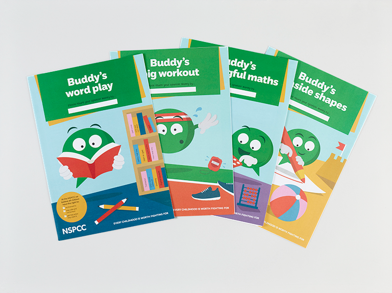
School Service re-brand
I re-designed and refreshed the Speak Out Stay Safe school service, a curriculum-aligned programme helping children recognise and speak out about abuse.
Using the NSPCC mascot Buddy, I created a bright, engaging visual style that makes the virtual assemblies and classroom activities more interactive, age-appropriate, and impactful.


NSPCC Annual Reports from 2017 – 2021
Designing the NSPCC’s annual reports through this five-year journey meant translating a powerful mission into a visual narrative of hope, transparency, and progress. Each edition evolved alongside the charity’s emerging 10-year strategy, shifting from traditional reporting to human stories and data-driven results. I crafted layouts that balanced empathy and evidence: child voices beside clean infographics, strategic aims expressed through open, optimistic design. The result was a series of reports that didn’t just inform but captured the NSPCC’s transformation toward a more forward-looking, preventative approach.

January Thank You
Direct Mail pack
This mailer was created to thank NSPCC’s most committed donors during the pandemic, highlighting the life-changing impact of their support and making them feel truly valued.
Feedback from my client and supporter:
“The best loyalty campaign NSPCC have run in years” and it raised £85,000 (against an £21,000 target, and usual income of £11,000)."
“I received this in the post yesterday and I just wanted to say how much I love it! Well done to the team who made it. I think it’s the best piece of NSPCC supporter material I’ve received!”

NSPCC Learning
Together for Childhood Report (2024)
I designed this research report to balance data clarity with emotional sensitivity. Using clean infographics, open layouts, and youth-centred quotes, the design makes complex findings accessible and human. Extended into local briefs and an animated summary, the visual language supports NSPCC Learning’s goal to empower young people’s voices and promote understanding around child protection.


